
You’ve almost certainly had this experience: you type your height and weight into an online calculator, it spits out a single number, and that number tells you whether you’re “healthy”, “overweight”, or something in between. Full stop. No context. No mention of where you carry weight, how much of it is muscle, or what your grandmother’s health looked like at the same number.
Why we built more than a BMI box
That’s the gap our Body Composition Calculator was built to close, and it’s also the reason the calculator page itself stays deliberately scannable. Behind those seven or eight measurements sits a genuinely interesting, genuinely contested body of research, and squeezing all of that nuance onto a results screen would do the science a disservice. So this article is where that nuance lives.
We’re going to walk through why BMI became the default in the first place (it’s a stranger story than you’d expect), what each of the newer measures actually captures, where the evidence is strong enough to state plainly, and where it’s still being argued out in the literature. Some of what follows will complicate things you thought were settled, and that’s intentional. Along the way, we’ll also highlight practical ways to interpret and use your results, so you can understand not just what the numbers mean, but what you might do with them. A number that tells you “you’re fine” or “you’re at risk” deserves to have its workings shown, and you deserve to know how to act on it.
If you’ve recently lost a significant amount of weight, you might also find our piece on what happens to your skin after weight loss useful alongside this one, since body composition tracking matters differently once skin laxity becomes part of the picture. And if you’re here because you’re navigating weight change on a GLP-1 medication, our article on life after Mounjaro covers some of the practical territory this piece doesn’t.
Why BMI was never built to describe you
Body mass index has a specific, traceable origin, and it isn’t a medical one. In the 1830s, a Belgian mathematician and astronomer named Adolphe Quetelet was trying to describe “the average man” for social statistics, not clinical medicine. He noticed that across a population, weight tended to vary roughly in proportion to the square of height, and he built an index, weight divided by height squared, to describe that population-level relationship. Quetelet wasn’t a doctor. He wasn’t trying to assess any individual’s health. He was doing what astronomers of his era did with any dataset: finding the “average man” the way you’d find the average position of a star.
That index sat largely unused in medicine for well over a century. It was picked up and rebranded as “body mass index” in a 1972 paper by physiologist Ancel Keys, who was specifically looking for a simple population-screening tool for large epidemiological studies, not an individual diagnostic. Keys himself was explicit that BMI was a reasonable population proxy for adiposity, useful for comparing groups of thousands of people, and he never claimed it could reliably describe a single person’s health.
Somewhere between the 1970s and today, that distinction got lost. BMI became the front door of nearly every health assessment, from insurance underwriting to GP surgeries, precisely because it’s cheap and needs nothing more than a tape measure and scales. But the statistical logic that makes it useful for describing a population of ten thousand people breaks down when you apply it to one person standing in front of you. It can’t distinguish muscle from fat. It can’t tell you where fat is stored, and where turns out to matter more for metabolic risk than how much in absolute terms. A muscular rugby player and a sedentary person with the same height and weight can land on an identical BMI and have almost nothing else in common metabolically.
This is the problem the rest of this article works through: once you accept that a single population-derived ratio can’t capture something as individual as your metabolic risk, what should you look at instead? The honest answer is that no single measure replaces BMI perfectly. But several measures, used together, tell you considerably more than BMI ever could alone.
Waist-to-height ratio: the strongest evidence on this page
If there’s one measure on the calculator that deserves to be stated with real confidence, it’s waist-to-height ratio (WHtR). The core message, borrowed directly from NICE guidance, is disarmingly simple: keep your waist circumference under half your height. NICE NG246 recommends this as a practical screening threshold (recommendation 1.9.8), specifically for adults with a BMI under 35 (recommendation 1.9.15). [1] Above that threshold, BMI itself becomes a strong enough signal on its own, and NICE’s guidance shifts its emphasis accordingly.
Why does this simple ratio work as well as it does? Because dividing waist circumference by height does something BMI can’t: it captures central, abdominal fat storage (the kind most strongly linked to cardiometabolic risk) whilst automatically adjusting for frame size. A six-foot-two person and a five-foot-two person with the same waist measurement in centimetres are not carrying the same relative risk, and WHtR accounts for that where a flat waist circumference cut-off cannot.
The evidence backing this isn’t a single study or a hopeful pilot. Ashwell, Gunn and Gibson’s 2012 systematic review and meta-analysis pooled data across more than 300,000 adults and found WHtR to be a significantly better screening tool than BMI for cardiometabolic risk factors, a finding that replicated consistently across the cohorts included. [2] The specific numbers behind that advantage come from Browning, Hsieh and Ashwell’s 2010 review, which reported an area under the receiver operating characteristic curve (AUROC) of 0.704 for WHtR compared with 0.671 for BMI. [3] That’s not a dramatic gap in absolute terms, but in a field where most anthropometric measures perform similarly to each other, a consistent, replicated advantage of this size is meaningful. AUROC is essentially a measure of how well a test can correctly rank people by risk; 0.5 would be no better than a coin toss, and 1.0 would be perfect discrimination, so both BMI and WHtR sit in the “meaningfully useful but imperfect” range, with WHtR ahead.
The specific “half your height” boundary value has separate support. Browning, Hsieh and Ashwell’s 2010 review proposed and examined the 0.5 cut-off as a simple, universally memorable message that performs consistently across different populations and age groups. [3]
Practically, this means WHtR is one of the few numbers on the calculator you can treat with genuine confidence rather than heavy hedging, provided you keep it inside its intended lane: a screening tool for adults with BMI under 35, not a diagnostic instrument on its own.
Waist-to-hip ratio: where you carry weight, not just how much
Waist-to-hip ratio (WHR) asks a related but distinct question to WHtR: not “is your waist large relative to your height” but “is your weight distributed centrally, around your abdomen, or more peripherally, around your hips and thighs.” The distinction matters because abdominal, visceral fat behaves differently in the body than fat stored elsewhere. Visceral fat sits around the organs and is metabolically active in ways that appear to drive insulin resistance and cardiovascular risk more directly than fat stored subcutaneously on the hips or thighs.
The WHO 2008 Expert Consultation on waist circumference and waist-hip ratio settled on a single, widely used threshold: a WHR above 0.90 for men and above 0.85 for women signals increased metabolic risk. [4] Unlike BRI below, WHR doesn’t currently have a U-shaped or nuanced categorical structure in the WHO guidance; it’s a single cut-off, applied the same way regardless of where in the “normal” range someone sits below it.
It’s worth being honest about what WHR doesn’t capture. It’s a ratio of two circumferences, and like any ratio, it can obscure the absolute numbers behind it. Two people can share an identical WHR whilst one carries far more total fat mass than the other. That’s precisely why the calculator presents WHR alongside waist circumference and WHtR rather than in isolation. Each measure is answering a slightly different question, and none of them is complete on its own.
Body Roundness Index: a U-shaped relationship, not a “lower is better” score
Body Roundness Index (BRI) is a newer measure, first proposed by Thomas and colleagues in 2013 using an elliptical geometric model of the body, [15] and it behaves differently to almost everything else on this page in a way that’s easy to misread if you’re not told about it directly. BRI does not have a simple “lower number, lower risk” relationship with mortality. It has a U-shape.
Zhang and colleagues’ 2024 study in JAMA Network Open, drawing on the US NHANES cohort, found that both very low and very high BRI values were associated with increased all-cause mortality risk, relative to a middle reference band (roughly the second and third quintiles of the population distribution). [5] In other words, the safest place to sit isn’t at the bottom of the scale. It’s in the middle. A BRI at the extreme low end of the distribution is not a “low risk” result on the calculator, and we’ve deliberately built it that way. The categories reflect the U-shape, not a simple ascending risk ladder.
We want to be careful about the strength of language we use here, because this evidence, whilst striking, comes from one cohort study (albeit a large, nationally representative one) that has since had one partial replication. That’s moderate-plus evidence, not systematic-review-grade certainty, and it means the exact numeric boundaries of the categories should be understood as derived from a single national dataset (NHANES, a US population) rather than a global consensus. They’re a genuinely useful signal, not an immutable law.
What might explain the U-shape? This is where we’re in the territory of hypothesis, not established mechanism, and it’s important to say so plainly. Zhang et al.’s study shows an association between very low BRI and mortality risk; it does not, and cannot, tell us why that association exists. One plausible explanation, discussed in the broader adiposity-mortality literature, is reverse causation: people at the very low end of central adiposity measures may include a meaningful number of individuals with low muscle mass, frailty, or occult illness (undiagnosed disease that’s already causing unintentional weight and muscle loss before it’s been picked up clinically). If that’s what’s driving part of the low-BRI signal, then a low BRI isn’t protective in itself. It may simply be flagging a different, less visible risk. This is a genuinely open question in the literature, not a settled mechanism, and we’d rather tell you that than dress up a plausible story as proven fact.
The practical takeaway: if your BRI result lands at either extreme, that’s worth paying attention to and, if it sits well outside the middle bands, worth discussing with your GP, rather than either dismissing a high result or celebrating a low one uncritically.
A Body Shape Index: what a percentile actually means, and why it’s contested
A Body Shape Index (ABSI) is the most statistically unusual measure on the calculator, and understanding what it outputs matters as much as understanding what it measures.
Krakauer and Krakauer’s 2012 paper built ABSI specifically to separate waist circumference from the parts of it that are just a byproduct of being taller or heavier overall (the parts BMI already captures). [6] The formula adjusts waist circumference for both height and weight, aiming to isolate something closer to “body shape, independent of size.” The result of that formula, on its own, is a fairly meaningless raw number, and it needs to be compared against a reference population to mean anything.
That’s why our calculator reports ABSI as an age- and sex-stratified percentile, using the NHANES 1999–2004 reference population that Krakauer and Krakauer’s original paper established, rather than presenting it as a raw score or a simple low/average/high verdict the way some other tools do. A percentile tells you where you sit relative to other people of your own age and sex, not relative to everyone. That stratification matters more than it might first appear: body shape shifts with age in ways that are normal, and a raw ABSI value that would be unusually high for a 25-year-old might sit squarely at the median for a 70-year-old. Reporting an unstratified number, or worse, an unstratified verdict, would risk telling a fit 25-year-old they’re at elevated risk based on a shape that’s actually entirely typical for someone twice their age, and vice versa. A percentile, properly stratified, avoids that error.
Here’s where we want to critique gently how ABSI is sometimes presented elsewhere online. It’s often framed as a superior, more sophisticated alternative to waist circumference or WHtR, on the strength of its more complex formula. The evidence doesn’t cleanly support that framing. ABSI is designed to capture body shape independent of BMI, and several cohort studies do support an association between higher ABSI and mortality or cardiometabolic risk. But its independent predictive value, whether it actually adds meaningfully useful information once you already know someone’s waist circumference or WHtR, is genuinely contested. Krakauer and Krakauer’s own 2012 paper is a useful illustration of how uneven that evidence is: their mortality association held for both White and Black participants in their study population, but not for participants of Mexican ethnicity, a caveat that’s easy to miss if you only encounter ABSI through secondary summaries of the research. [6] The pattern has continued since. Cohort studies examining ABSI in Spanish, Chinese, Iranian and Korean populations have reported inconsistent results for how much independent predictive value it adds once waist circumference or WHtR is already known, with some finding a modest additional benefit and others finding none at all. That inconsistency across populations is itself the honest finding here: ABSI’s added value over simpler measures isn’t a settled question, and treating it as a straightforwardly superior metric overstates what the current evidence supports.
The framing we’d stand behind: ABSI is one more lens on body shape, and a reasonably clever one, but it isn’t scientifically superior to the simpler, cheaper measures already covered above. Its main practical value on our calculator is the age/sex stratification itself, which gives you a genuinely different piece of context, where you sit relative to your own demographic, rather than a competing verdict on your risk.
Waist circumference: two tiers, not one line in the sand
Waist circumference on its own, without dividing by height or hip measurement, remains one of the most heavily validated anthropometric measures in the literature, largely because it’s a reasonably direct proxy for visceral fat and it’s simple to measure consistently.
Lean, Han and Morrison’s 1995 paper in the BMJ established the two-tier “action level” system that NICE and most UK clinical guidance still uses. [7] Rather than a single pass/fail line, there are two thresholds: an “increased risk” level (94 cm for men, 80 cm for women) and a “substantially increased risk” level (102 cm for men, 88 cm for women). The two-tier structure matters because it treats risk as a gradient rather than a cliff edge. Someone just past the first threshold is in a different risk category from someone well past the second, and the guidance was deliberately designed to reflect that rather than collapsing everyone above a single number into a single undifferentiated group.
We’ll come back to why these thresholds shift for some ethnic groups in the section below on ethnicity-specific risk.
Body fat percentage: Navy tape versus Jackson-Pollock callipers
The calculator offers two ways to estimate body fat percentage, and they trade off accuracy against how forgiving they are of imperfect technique, which matters enormously, because both methods are estimates built on population equations, not direct measurements of your actual fat mass.
The US Navy method uses waist, neck, and (for women) hip circumference, plugged into an equation. It’s popular precisely because it’s self-administrable with nothing more than a flexible tape measure, and it’s relatively forgiving of small measurement errors. A millimetre or two of inconsistency in where you wrap the tape won’t meaningfully change your result. That forgiveness comes with a trade-off in precision. The Navy method is commonly cited as accurate to within around 3–5% of laboratory reference methods. However, independent validation studies have reported larger errors: Moon and colleagues (2008) found a total error of about 5.2% against a three-compartment reference model, and accuracy tends to degrade for very muscular or very lean individuals. [8] That’s a real margin worth knowing about rather than treating a Navy result as an exact figure.
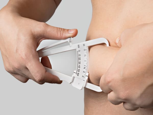
The Jackson-Pollock method takes a fundamentally different approach: skinfold callipers pinch a fold of skin and subcutaneous fat at specific anatomical sites, and those measurements feed into a sex-specific equation. Jackson and Pollock’s original 1978 paper [9] established the three-site protocol for men (chest, abdomen, thigh), and Jackson, Pollock and Ward’s follow-up 1980 paper [10] established the equivalent three-site protocol for women (triceps, suprailiac, thigh). The sites differ by sex because typical fat distribution patterns differ by sex, and the original research teams built and validated separate equations accordingly.
Done well, Jackson-Pollock is capable of real precision. But “done well” is doing a lot of work in that sentence. Skinfold measurement is a practitioner skill: finding the exact anatomical landmark, pinching a true skinfold rather than skin-plus-underlying-muscle, applying consistent calliper pressure, and taking the reading at the correct moment after the calliper is released all require training and repetition to get right. Self-administered skinfold measurements, particularly at sites like the back or the exact midaxillary line, are difficult to reach and reproduce consistently on your own body, and small technique errors compound across three separate sites into a meaningfully inaccurate final estimate.
This is where the two methods part ways in a practical sense, not a marketing one. If you’re measuring yourself at home, the Navy method’s forgiveness of imperfect technique makes it the more reliable choice for a self-check, precisely because there’s less room for a wobbly tape measurement to throw the whole result off. If you want the extra precision Jackson-Pollock is capable of, that precision only really shows up when someone experienced in the protocol is doing the pinching. This is one of the reasons we offer Jackson-Pollock skinfold assessment as an in-clinic measurement at Creative Touch: having a trained member of staff take the three readings at the correct sites, with consistent technique across repeat visits, removes the single biggest source of error in the method. It’s not a case of the self-measured version being unreliable and the clinic version being sold as the answer to that. It’s simply that this particular measurement does depend on hands-on technique to deliver the precision it’s capable of, in the same way a blood pressure reading is more reliable when taken by someone trained to position the cuff correctly. If you’re tracking body composition over time and want that extra layer of consistency, it’s worth asking about at your next visit; if you’re happy with the Navy method’s self-administered convenience, that’s a perfectly reasonable choice too.
Why the thresholds change for some ethnic groups
You’ll notice a brief note on the calculator itself when certain ethnicities are selected, adjusting the waist circumference and related thresholds downward. That single sentence is doing a lot of scientific work, and it deserves unpacking here.
At an equivalent BMI, or even an equivalent waist circumference, South Asian populations reach the same level of diabetes and cardiometabolic risk at meaningfully lower thresholds than White European populations do. Bodicoat and colleagues (2014), examining BMI and waist circumference cut-points across multi-ethnic populations in the UK and India, [11] and Tillin and colleagues (2015), following three ethnic groups in the UK prospectively for incident type 2 diabetes, [12] both support this: the same waist measurement or BMI simply doesn’t carry the same risk across ethnic groups.
What’s less settled is why. It’s tempting to reach for a simple explanation: that South Asian populations carry a higher proportion of visceral (organ-surrounding) fat relative to subcutaneous (under-the-skin) fat at a given BMI, and that explanation has circulated widely online. But the strongest evidence available on this specific question complicates it. A 2023 systematic review and meta-analysis by Iliodromiti and colleagues, pooling new and previously published data comparing South Asian and White European adults at similar BMI, found no significant difference in visceral fat between the two groups. [13] The difference showed up more in subcutaneous fat, and particularly in ectopic fat stored in the liver. So the threshold difference is well established and clinically important; the mechanism behind it is still being worked out, and the popular visceral-fat explanation looks to be, at best, only part of the story.
The practical consequence is that using the same waist circumference cut-off for everyone would systematically under-flag risk in populations where metabolic complications tend to appear at lower absolute waist measurements. Ethnicity-specific thresholds aren’t an adjustment for the sake of inclusivity in a token sense; they reflect a real, biologically grounded difference in how fat distribution translates into risk, and using a single universal cut-off would genuinely under-serve the populations affected by it.
Fat-Free Mass Index: a gap, not an oversight
The last measure worth explaining is Fat-Free Mass Index (FFMI), which estimates how much of your body weight is made up of lean mass (muscle, bone, organs, everything that isn’t fat) relative to your height, in a way that’s roughly analogous to how BMI relates weight to height.
Kouri and colleagues’ 1995 paper established the reference ranges most commonly cited for FFMI today. [14] That reference data was built from a sample of male athletes, and it has never been extended by a comparably validated study into an equivalent set of category bands for women. That’s not a small caveat. It means any female FFMI “category” you might see quoted elsewhere on the internet, sorting a result into low, average, or high, is not resting on validated research the way the male categories are.
Our calculator deliberately does not display a female FFMI category as a result of this gap, even though it will still calculate and show the underlying number for anyone who wants it. We’d rather show you an honest number with no invented verdict attached than borrow a male-derived category system and quietly apply it to women as if the underlying research supported that extension, when it doesn’t. If that research gap gets filled by future work, we’ll update the calculator accordingly. Until then, treat a female FFMI result as informative raw data to track over time in your own record, not as a benchmark against an established “normal” range, because that range simply doesn’t exist yet in the validated literature.
Bringing it together
No single number on this calculator, including the newer ones that improve on BMI in specific ways, is designed to stand alone. WHtR is the strongest, most confidently evidenced measure here, and it’s worth taking seriously within its intended scope. BRI and ABSI are useful additional lenses, but each comes with real caveats: BRI’s U-shape means a low result isn’t automatically a good result, and ABSI’s added value over simpler measures like WHtR is still being argued out in the literature. Waist circumference and WHR tell you about distribution in ways total weight never could. Body fat percentage, however it’s measured, is an estimate built on population equations, not a direct measurement of your actual tissue composition.
None of these numbers exists to hand you a verdict on your worth or your discipline. Ageing itself naturally shifts body composition, and that’s a normal, expected process, not a failure to manage. What these measures are for is giving you and, where relevant, your GP a fuller, more honest picture than a single ratio from a nineteenth-century population study ever could, so that if something in that picture is worth a conversation, you have the specific detail to have it with. We’d also point you to our tool exploring eating patterns and food addiction (the YFAS), if you’re looking at your relationship with weight and body composition from a behavioural angle as well as a measurement one.
So what do you actually do with a page of results? Less than the numbers might tempt you to. The calculator was built to hand you detail rather than a verdict, so that if something in the picture is worth a conversation, you can have it with specifics instead of a single vague figure. The questions below walk through how to read your own results in practice; the honest short version is that no one measurement decides anything, and a picture is only worth acting on when more than one part of it agrees.
Frequently Asked Questions
- How should I interpret my own results and decide what, if anything, to do?
Start with waist-to-height ratio. It’s the measure on this page backed by the deepest, most consistently replicated evidence, so treat it as your anchor. The rest, WHR, BRI, ABSI and body fat percentage, aren’t there to overrule it. They’re there to add texture.
A few things are worth keeping in mind as you read across your results:
- No single number is a verdict - each measure answers a slightly different question, and none was designed to stand alone.
- Look for agreement, not just outliers - one measure sitting slightly outside its “ideal” band matters less than several measures pointing the same direction.
- Extremes deserve attention either way - a very high or very low result on any measure, BRI especially, is worth noticing rather than dismissing.
If more than one measure is flagging something, or a single result sits well outside its typical range, that’s a reasonable prompt to mention it at your next GP appointment, not a diagnosis in itself.
- How do I take these measurements accurately at home?
The calculator itself walks you through tape placement for each measurement, with diagrams and step-by-step bullets for every site, so we won’t repeat that protocol here. What’s worth adding is the principle behind it: consistency matters more than perfection. Measuring the same way, at the same time of day, under similar conditions each time you check in tells you more than any single “perfect” reading.
The errors we see most often when people measure themselves:
- Holding your breath or sucking in - a natural reflex, but it shrinks the reading and doesn’t reflect your relaxed waist.
- Tape too tight or too loose - it should sit snug against the skin without compressing it.
- Inconsistent landmark - measuring from a slightly different spot each session adds noise that has nothing to do with real change.
Repeatability over time beats a single flawless reading. For exact placement at each site, the calculator’s own measurement guide has diagrams to walk you through it.
- My result is outside the recommended range - should I see a healthcare professional immediately?
Usually not immediately. A single result sitting outside a “typical” band is a prompt to pay attention, not a medical emergency, and these are screening measures, not diagnostic ones. Try not to read one number as a verdict on your health.
It’s worth raising at your next routine GP appointment, rather than booking an urgent one, if:
- The result persists - it’s still outside range weeks or months later, not just on one occasion.
- Several measures agree - your WHtR, WHR and BRI are all pointing the same direction, not just one outlier.
- You’re at an extreme - a very high or very low result, BRI especially, deserves attention either way, given the U-shaped relationship covered above.
None of that is cause for alarm. It’s simply a nudge to have a specific, informed conversation next time you’re already seeing your GP, rather than something to sit with in silence.
- How often should I re-measure to see meaningful change?
Roughly monthly is a sensible minimum for waist-based measures like WHtR and WHR. Checking more often than that mostly picks up measurement noise, not real change.
Verweij and colleagues’ 2013 review of waist circumference measurement error found that a short-term change needs to run to several centimetres before it reliably exceeds the error built into the measurement itself. [16] Set that against how slowly waist circumference typically shifts, even with consistent effort, and a week-to-week check is unlikely to show anything real; the signal simply hasn’t had time to clear the noise.
The same logic holds for body fat percentage. Both the Navy and Jackson-Pollock methods carry their own margins of error, covered above, so a monthly-to-six-weekly cadence tracks genuine change more honestly than daily or weekly checks ever could.
There’s a wellness case for stepping back from frequent checking too, in our view, though that’s judgement rather than evidence: fewer, more considered check-ins tend to sit more comfortably alongside a settled relationship with your own body.
- I’m of mixed heritage. Which ethnicity-specific threshold applies to me?
Honestly, there isn’t a validated threshold built for mixed heritage, and that’s a genuine gap in the underlying guidance, not something we’ve overlooked. NICE NG246 sets out ethnicity-specific BMI thresholds and names six specific groups (South Asian, Chinese, other Asian, Middle Eastern, Black African and African-Caribbean), but says nothing about mixed ancestry. The WHO guidance we also draw on appears to be silent on it too. Even a 2024 study that specifically tried to study a “mixed” group, using UK Biobank data, could only draw on 1,189 people out of almost 300,000, far too small to produce a usable clinical cut-off.
A sensible, if unofficial, precaution: if any part of your heritage falls within a group that reaches risk at lower measurements, applying that lower threshold flags earlier rather than later. This is standard screening-tool logic, not a guideline recommendation.
If your result sits anywhere near a threshold and your heritage doesn’t map neatly onto our categories, that ambiguity is itself worth raising with your GP.
- Is a low Body Roundness Index a good result?
No, and this is worth stating plainly. A very low BRI isn’t automatically a good result. The evidence shows a U-shaped relationship between BRI and mortality risk, meaning the safest place to sit is the middle of the range, not the bottom of it.
A BRI at the extreme low end can flag something less visible than “healthy”: low muscle mass, frailty, or an undiagnosed illness already causing unintentional weight and muscle loss. This is an observed association from cohort data, though, not a proven mechanism, so a low result isn’t automatically a red flag either. It’s a signal worth understanding, not alarming.
If your BRI sits well outside the middle bands, at either end, that’s worth discussing with your GP rather than celebrating or dismissing it on its own.
- Why doesn’t the calculator give me a female FFMI category?
Because the reference data simply hasn’t been built for women yet, and we’d rather be honest about that than invent a verdict. The category bands most commonly cited for FFMI come from Kouri and colleagues’ 1995 study, based on a sample of male athletes. Nobody has since published a comparably validated set of category bands for women.
Rather than borrow the male-derived “low, average, high” categories and quietly apply them to a female result, as some other tools do, we show you the number itself and leave it there. That’s not a limitation we’re apologising for. It’s respect for what the evidence can and can’t currently support.
If you’re tracking your FFMI over time, treat it as useful raw data for your own record rather than a benchmark against an established range, since that range doesn’t yet exist in the validated research.
References
National Institute for Health and Care Excellence (NICE) (2026). Overweight And Obesity Management Pdf 66143959958725. National Institute for Health and Care Excellence (NICE). nice.org.uk/…t-pdf-66143959958725 (Accessed: 2026-07-23)
Ashwell, M., Gunn, P., Gibson, S. (2012). Waist-to-height ratio is a better screening tool than waist circumference and BMI for adult cardiometabolic risk factors: systematic review and meta-analysis. Obesity reviews : an official journal of the International Association for the Study of Obesity, 13(3), 275-86. doi.org/10.1111/j.1467-789X.2011.00952.x
doi: 10.1111/j.1467-789X.2011.00952.xBrowning, L.M., Hsieh, S.D., Ashwell, M. (2010). A systematic review of waist-to-height ratio as a screening tool for the prediction of cardiovascular disease and diabetes: 0·5 could be a suitable global boundary value. Nutrition research reviews, 23(2), 247-69. doi.org/10.1017/S0954422410000144
doi: 10.1017/S0954422410000144World Health Organization (2008). Waist circumference and waist-hip ratio: report of a WHO expert consultation. World Health Organization. ISBN: 9789241501491
Zhang, X., Ma, N., Lin, Q., Chen, K., Zheng, F., Wu, J., Dong, X., Niu, W. (2024). Body Roundness Index and All-Cause Mortality Among US Adults. JAMA network open, 7(6), e2415051. doi.org/10.1001/jamanetworkopen.2024.15051
doi: 10.1001/jamanetworkopen.2024.15051Krakauer, N.Y., Krakauer, J.C. (2012). A new body shape index predicts mortality hazard independently of body mass index. PloS one, 7(7), e39504. doi.org/10.1371/journal.pone.0039504
doi: 10.1371/journal.pone.0039504Lean, M.E., Han, T.S., Morrison, C.E. (1995). Waist circumference as a measure for indicating need for weight management. BMJ (Clinical research ed.), 311(6998), 158-61. doi.org/10.1136/bmj.311.6998.158
doi: 10.1136/bmj.311.6998.158Moon, J.R., Tobkin, S.E., Smith, A.E., Roberts, M.D., Ryan, E.D., Dalbo, V.J., Lockwood, C.M., Walter, A.A., Cramer, J.T., Beck, T.W., Stout, J.R. (2008). Percent body fat estimations in college men using field and laboratory methods: a three-compartment model approach. Dynamic medicine : DM, 7(), 7. doi.org/10.1186/1476-5918-7-7
doi: 10.1186/1476-5918-7-7Jackson, A., Pollock, M. (1978). Generalized equations for predicting body density of men. British Journal of Nutrition, 40(3), 497-504. doi.org/10.1079/BJN19780152
doi: 10.1079/BJN19780152Jackson, A.S., Pollock, M.L., Ward, A. (1980). Generalized equations for predicting body density of women. Medicine and science in sports and exercise, 12(3), 175-81. PubMed: 7402053
pmid7402053Bodicoat, D.H., Gray, L.J., Henson, J., Webb, D., Guru, A., Misra, A., Gupta, R., Vikram, N., Sattar, N., Davies, M.J., Khunti, K. (2014). Body mass index and waist circumference cut-points in multi-ethnic populations from the UK and India: the ADDITION-Leicester, Jaipur heart watch and New Delhi cross-sectional studies. PloS one, 9(3), e90813. doi.org/10.1371/journal.pone.0090813
doi: 10.1371/journal.pone.0090813Tillin, T., Sattar, N., Godsland, I.F., Hughes, A.D., Chaturvedi, N., Forouhi, N.G. (2015). Ethnicity-specific obesity cut-points in the development of Type 2 diabetes - a prospective study including three ethnic groups in the United Kingdom. Diabetic medicine : a journal of the British Diabetic Association, 32(2), 226-34. doi.org/10.1111/dme.12576
doi: 10.1111/dme.12576Iliodromiti, S., McLaren, J., Ghouri, N., Miller, M.R., Dahlqvist, L.e.i.n.h.a.r.d.O., Linge, J., Ballantyne, S., Platt, J., Foster, J., Hanvey, S., Gujral, U.P., Kanaya, A., Sattar, N., Lumsden, M.A., Gill, J.M.R. (2023). Liver, visceral and subcutaneous fat in men and women of South Asian and white European descent: a systematic review and meta-analysis of new and published data. Diabetologia, 66(1), 44-56. doi.org/10.1007/s00125-022-05803-5
doi: 10.1007/s00125-022-05803-5Kouri, E.M., Pope, H.G.J.r., Katz, D.L., Oliva, P. (1995). Fat-free mass index in users and nonusers of anabolic-androgenic steroids. Clinical journal of sport medicine : official journal of the Canadian Academy of Sport Medicine, 5(4), 223-8. doi.org/10.1097/00042752-199510000-00003
doi: 10.1097/00042752-199510000-00003Thomas, D.M., Bredlau, C., Bosy-Westphal, A., Mueller, M., Shen, W., Gallagher, D., Maeda, Y., McDougall, A., Peterson, C.M., Ravussin, E., Heymsfield, S.B. (2013). Relationships between body roundness with body fat and visceral adipose tissue emerging from a new geometrical model. Obesity (Silver Spring, Md.), 21(11), 2264-2271. doi.org/10.1002/oby.20408
doi: 10.1002/oby.20408Verweij, L.M., Terwee, C.B., Proper, K.I., Hulshof, C.T.J., van Mechelen, W. (2013). Measurement error of waist circumference: gaps in knowledge. Public health nutrition, 16(2), 281-8. doi.org/10.1017/S1368980012002741
doi: 10.1017/S1368980012002741